
DIYing Your Squarespace Site? 8 Essential Guardrails to Prevent a Design Disaster
Taking control of your Squarespace website updates can be so empowering! It saves money, keeps your content fresh, and gives you complete ownership over your digital footprint.
However, Squarespace’s flexibility—especially with the introduction of Fluid Engine—means it’s now easier than ever to inadvertently make your site look messy, load slowly, or totaly fail on mobile devices.
If you are DIYing your website updates, you’ll need a system. Before you launch into your next editing sesh, come back to this article and use these eight helpful guidelines. They will save you time, frustration, and most importantly, your pro reputation.
1. The Image Optimization Imperative
Your visuals should be clear, crisp, and high-resolution, but they can’t be massive file sizes. Uploading unoptimized images (like raw photos straight from a camera) will inhibit your site's loading speed. If your site takes too long to load, visitors will leave, and Google will penalize your search ranking.
Keep it Clear and Crisp: Use high-resolution images, but save them as JPEGs (for photos) or PNGs (for graphics) to balance quality and file size.
Size Matters: Aim for a width of 1500px to 2500px for full-bleed banners. For smaller blog or product images, stay under 1000px. Try to keep every file under 500KB.
Rename for SEO: Never upload an image named
IMG_1234.jpg. Rename it to something descriptive that uses keywords, e.g.,modern-kitchen-renovation-austin.jpg. This tells search engines what is in the photo, boosting your image SEO.
2. Conquer the Mobile View (It’s Not Automatic!)
Did you know around 70% of your visitors now browse from their phones? While Squarespace tries to make mobile responsiveness easy, it’s not perfect, particularly in Fluid Engine. Every time you make a change to your website remember to go in to your mobile view and check it out to be sure all is well.
Shore up white space: What looks like a nice gap on desktop might become a massive, confusing void on a narrow mobile screen.
Prevent overlapping boxes: Elements must be stacked vertically on mobile. If you have text overlapping an image in the editor (which Fluid Engine allows), check your mobile view. On a smaller screen, that text might become unreadable, or a button might become unclickable. Ensure all elements an boxes are stacked on mobile.
3. Ban Placeholder Pages
If a visitor clicks a link in your main navigation—say, "Portfolio"—and lands on a blank white page or a spinning "Coming Soon" graphic, they immediately lose trust in your professionalism. It looks unfinished.
If you don't have content ready, do not include the page in your main navigation. Put it in the "Not Linked" section instead.
4. If You Aren't Using a Section, Save it for Later
If you're experimenting with a new section layout at the bottom of a page, or if you have a section you want on a page but there’s no content for it as of yet, such as an events summary block with no events in it yet, it’s best to wait until you have content to publish that on the page.
Why? Because extra sections, complex layouts, and additional images—even unused ones—increase loading time and leave big blank spots in your design. If you want to save a section design to use later you can:
duplicate that page and save the duplicate in your not linked section for later reference
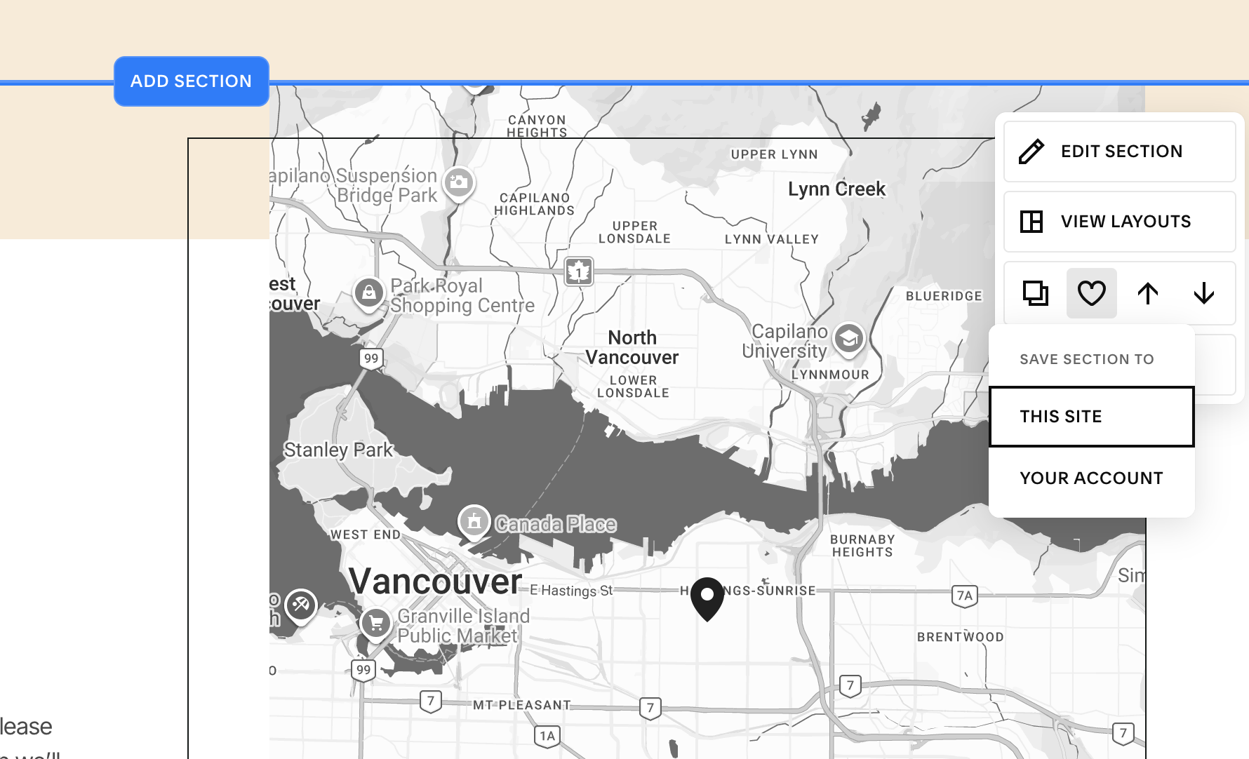
save that section to your website via your “Edit Section” menu! This is a cool feature in Squarespace that enables you to reuse sections over and over.
5. Copy Edit like a Pro
Incomplete sentences and typos scream "amateur." Read your text out loud. If you find a fragment that doesn't serve a stylistic purpose, fix it. Use a tool like Grammarly or Hemingway to catch what your eyes might miss after staring at the screen for hours.
6. Function First, "Pretty" Second
This is the most important rule of web design: A plain, boring website that works will always outperform a stunning website that is broken.
Test everything. Test your contact forms (where does that email actually go?). Test your buttons. If you added custom CSS, test how it behaves on different screen sizes. There is nothing more frustrating than landing on a website and being unable to complete a simple action like sending a message. And you don’t want your audience to be frustrated on your site!
7. Save Your Work Manually (Squarespace Doesn't Autosave!)
I have repeated this so many times to clients over the years I prolly sound like a broken record but I cannot stress this enough: Squarespace does not have an autosave feature.
If your Wi-Fi blips, your laptop dies, or your browser crashes, any changes you made since you last hit "Done" and "Save" are gone forever. Develop a rhythm. Every 10-15 minutes, or after editing one significant section, save your work.
8. Back Up Your Changes Off-Site
Squarespace is a magnificent hosting and building platform, but it is not a digital library.
Do not rely on Squarespace to hold the only copy of your brand and biz essentials. Keep a dedicated folder (e.g., in Google Drive, Dropbox, or an external hard drive) containing all your optimized images, your colour palette (hex codes), and a document with all your final website copy. If you ever accidentally delete a page (it happens to the best of us), having that backup is the difference between a minor annoyance and a total meltdown.
The Final Step
Before you log out and close your browser, there is one final rule to follow:
Recheck your mobile view. Here’s me again with that broken record! This should be the very last action you take before you finish your updates. Small tweaks on the desktop editor can sometimes drastically reorganize the mobile layout. Always, always verify it looks polished on the smallest screen before you step away.